
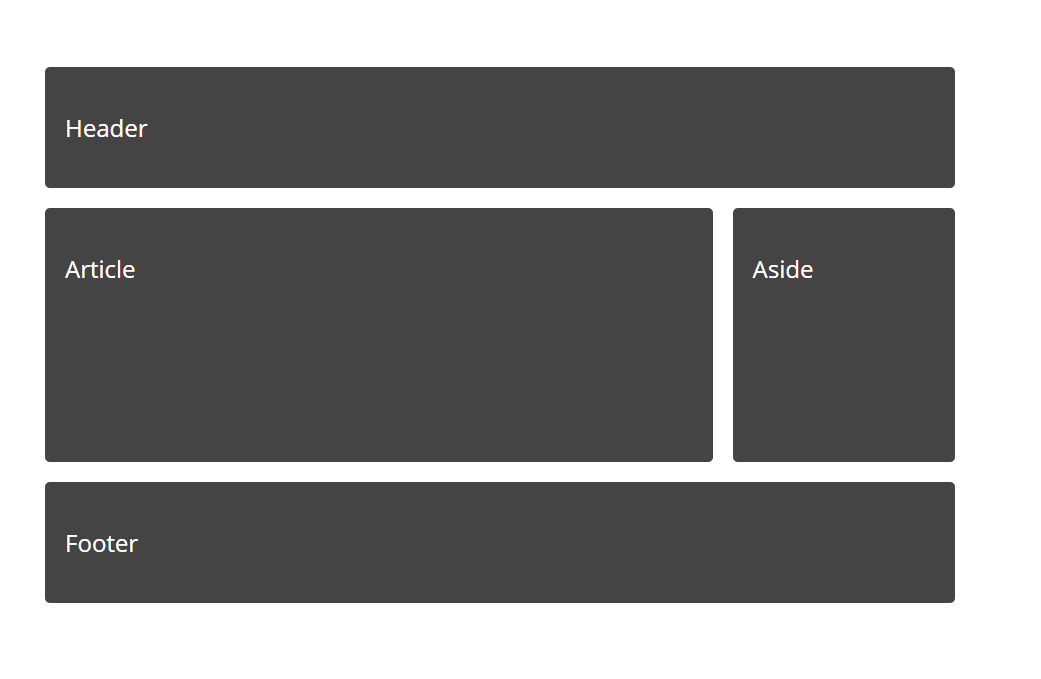
Here is an example of how simple is to make a standard website layout with CSS grid and edit it with Sitecake. No need for Bootstrap, Foundation, or any other framework, CSS is now powerful to handle layouts.
So here is HTML
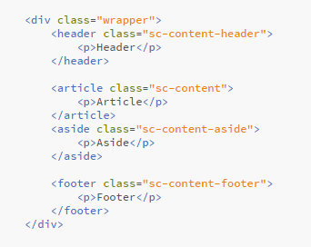
Here you can notice several things:
- sc-content classes are attached to header, article, aside and footer tags
 yes, it works
 - repeaters are used for the header (sc-content-header), sidebar (sc-content-aside) and footer (sc-content-footer) because this is the content that, once edited, will be auto-updated on all website pages
CSS, the part that creates grid layout
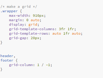
- grid-template-rows: auto 1fr auto; is telling the browser to make a sticky footer. Auto-size the header, as big as the possible main content, and auto-size the footer area.
everything is on the Codepen
and Github