
Dear Sitecake Family.
i’m Rly New at this Forum but before i started, i wanna to say thanks to the Sitecake Team For That Nice Project  …
…
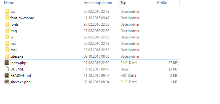
So i have Download This Template and so how it looks in my Folder
and this is the code From my index.php
<?php include "sitecake/server/sitecake_entry.php"; ?>
<!DOCTYPE html>
<html lang="en">
<head>
<meta charset="utf-8">
<meta http-equiv="X-UA-Compatible" content="IE=edge">
<meta name="viewport" content="width=device-width, initial-scale=1">
<meta name="description" content="">
<meta name="author" content="">
<title>Freelancer - Start Bootstrap Theme</title>
<!-- Bootstrap Core CSS - Uses Bootswatch Flatly Theme: http://bootswatch.com/flatly/ -->
<link href="css/bootstrap.min.css" rel="stylesheet">
<!-- Custom CSS -->
<link href="css/freelancer.css" rel="stylesheet">
<!-- Custom Fonts -->
<link href="font-awesome/css/font-awesome.min.css" rel="stylesheet" type="text/css">
<link href="http://fonts.googleapis.com/css?family=Montserrat:400,700" rel="stylesheet" type="text/css">
<link href="http://fonts.googleapis.com/css?family=Lato:400,700,400italic,700italic" rel="stylesheet" type="text/css">
<!-- HTML5 Shim and Respond.js IE8 support of HTML5 elements and media queries -->
<!-- WARNING: Respond.js doesn't work if you view the page via file:// -->
<!--[if lt IE 9]>
<script src="https://oss.maxcdn.com/libs/html5shiv/3.7.0/html5shiv.js"></script>
<script src="https://oss.maxcdn.com/libs/respond.js/1.4.2/respond.min.js"></script>
<![endif]-->
</head>
<body id="page-top" class="index">
<!-- Navigation -->
<nav class="navbar navbar-default navbar-fixed-top">
<div class="container">
<!-- Brand and toggle get grouped for better mobile display -->
<div class="navbar-header page-scroll">
<button type="button" class="navbar-toggle" data-toggle="collapse" data-target="#bs-example-navbar-collapse-1">
<span class="sr-only">Toggle navigation</span>
<span class="icon-bar"></span>
<span class="icon-bar"></span>
<span class="icon-bar"></span>
</button>
<a class="navbar-brand" href="#page-top">Start Bootstrap</a>
</div>
<!-- Collect the nav links, forms, and other content for toggling -->
<div class="collapse navbar-collapse" id="bs-example-navbar-collapse-1">
<ul class="nav navbar-nav navbar-right">
<li class="hidden">
<a href="#page-top"></a>
</li>
<li class="page-scroll">
<a href="#portfolio">Portfolio</a>
</li>
<li class="page-scroll">
<a href="#about">About</a>
</li>
<li class="page-scroll">
<a href="#contact">Contact</a>
</li>
</ul>
</div>
<!-- /.navbar-collapse -->
</div>
<!-- /.container-fluid -->
</nav>
<!-- Header -->
<header>
<div class="container">
<div class="row">
<div class="col-lg-12">
<img class="img-responsive" src="img/profile.png" alt="">
<div class="intro-text">
<span class="name">Start Bootstrap</span>
<hr class="star-light">
<span class="skills">Web Developer - Graphic Artist - User Experience Designer</span>
</div>
</div>
</div>
</div>
</header>
<!-- Portfolio Grid Section -->
<section id="portfolio">
<div class="container">
<div class="row">
<div class="col-lg-12 text-center">
<h2>Portfolio</h2>
<hr class="star-primary">
</div>
</div>
<div class="row">
<div class="col-sm-4 portfolio-item">
<a href="#portfolioModal1" class="portfolio-link" data-toggle="modal">
<div class="caption">
<div class="caption-content">
<i class="fa fa-search-plus fa-3x"></i>
</div>
</div>
<img src="img/portfolio/cabin.png" class="img-responsive" alt="">
</a>
</div>
<div class="col-sm-4 portfolio-item">
<a href="#portfolioModal2" class="portfolio-link" data-toggle="modal">
<div class="caption">
<div class="caption-content">
<i class="fa fa-search-plus fa-3x"></i>
</div>
</div>
<img src="img/portfolio/cake.png" class="img-responsive" alt="">
</a>
</div>
<div class="col-sm-4 portfolio-item">
<a href="#portfolioModal3" class="portfolio-link" data-toggle="modal">
<div class="caption">
<div class="caption-content">
<i class="fa fa-search-plus fa-3x"></i>
</div>
</div>
<img src="img/portfolio/circus.png" class="img-responsive" alt="">
</a>
</div>
<div class="col-sm-4 portfolio-item">
<a href="#portfolioModal4" class="portfolio-link" data-toggle="modal">
<div class="caption">
<div class="caption-content">
<i class="fa fa-search-plus fa-3x"></i>
</div>
</div>
<img src="img/portfolio/game.png" class="img-responsive" alt="">
</a>
</div>
<div class="col-sm-4 portfolio-item">
<a href="#portfolioModal5" class="portfolio-link" data-toggle="modal">
<div class="caption">
<div class="caption-content">
<i class="fa fa-search-plus fa-3x"></i>
</div>
</div>
<img src="img/portfolio/safe.png" class="img-responsive" alt="">
</a>
</div>
<div class="col-sm-4 portfolio-item">
<a href="#portfolioModal6" class="portfolio-link" data-toggle="modal">
<div class="caption">
<div class="caption-content">
<i class="fa fa-search-plus fa-3x"></i>
</div>
</div>
<img src="img/portfolio/submarine.png" class="img-responsive" alt="">
</a>
</div>
</div>
</div>
</section>
<!-- About Section -->
<section class="success" id="about">
<div class="container">
<div class="row">
<div class="col-lg-12 text-center">
<h2>About</h2>
<hr class="star-light">
</div>
</div>
<div class="row">
<div class="col-lg-4 col-lg-offset-2">
<p>Freelancer is a free bootstrap theme created by Start Bootstrap. The download includes the complete source files including HTML, CSS, and JavaScript as well as optional LESS stylesheets for easy customization.</p>
</div>
<div class="col-lg-4">
<p>Whether you're a student looking to showcase your work, a professional looking to attract clients, or a graphic artist looking to share your projects, this template is the perfect starting point!</p>
</div>
<div class="col-lg-8 col-lg-offset-2 text-center">
<a href="#" class="btn btn-lg btn-outline">
<i class="fa fa-download"></i> Download Theme
</a>
</div>
</div>
</div>
</section>
<!-- Contact Section -->
<section id="contact">
<div class="container">
<div class="row">
<div class="col-lg-12 text-center">
<h2>Contact Me</h2>
<hr class="star-primary">
</div>
</div>
<div class="row">
<div class="col-lg-8 col-lg-offset-2">
<!-- To configure the contact form email address, go to mail/contact_me.php and update the email address in the PHP file on line 19. -->
<!-- The form should work on most web servers, but if the form is not working you may need to configure your web server differently. -->
<form name="sentMessage" id="contactForm" novalidate>
<div class="row control-group">
<div class="form-group col-xs-12 floating-label-form-group controls">
<label>Name</label>
<input type="text" class="form-control" placeholder="Name" id="name" required data-validation-required-message="Please enter your name.">
<p class="help-block text-danger"></p>
</div>
</div>
<div class="row control-group">
<div class="form-group col-xs-12 floating-label-form-group controls">
<label>Email Address</label>
<input type="email" class="form-control" placeholder="Email Address" id="email" required data-validation-required-message="Please enter your email address.">
<p class="help-block text-danger"></p>
</div>
</div>
<div class="row control-group">
<div class="form-group col-xs-12 floating-label-form-group controls">
<label>Phone Number</label>
<input type="tel" class="form-control" placeholder="Phone Number" id="phone" required data-validation-required-message="Please enter your phone number.">
<p class="help-block text-danger"></p>
</div>
</div>
<div class="row control-group">
<div class="form-group col-xs-12 floating-label-form-group controls">
<label>Message</label>
<textarea rows="5" class="form-control" placeholder="Message" id="message" required data-validation-required-message="Please enter a message."></textarea>
<p class="help-block text-danger"></p>
</div>
</div>
<br>
<div id="success"></div>
<div class="row">
<div class="form-group col-xs-12">
<button type="submit" class="btn btn-success btn-lg">Send</button>
</div>
</div>
</form>
</div>
</div>
</div>
</section>
<!-- Footer -->
<footer class="text-center">
<div class="footer-above">
<div class="container">
<div class="row">
<div class="footer-col col-md-4">
<h3>Location</h3>
<p>3481 Melrose Place<br>Beverly Hills, CA 90210</p>
</div>
<div class="footer-col col-md-4">
<h3>Around the Web</h3>
<ul class="list-inline">
<li>
<a href="#" class="btn-social btn-outline"><i class="fa fa-fw fa-facebook"></i></a>
</li>
<li>
<a href="#" class="btn-social btn-outline"><i class="fa fa-fw fa-google-plus"></i></a>
</li>
<li>
<a href="#" class="btn-social btn-outline"><i class="fa fa-fw fa-twitter"></i></a>
</li>
<li>
<a href="#" class="btn-social btn-outline"><i class="fa fa-fw fa-linkedin"></i></a>
</li>
<li>
<a href="#" class="btn-social btn-outline"><i class="fa fa-fw fa-dribbble"></i></a>
</li>
</ul>
</div>
<div class="footer-col col-md-4">
<h3>About Freelancer</h3>
<p>Freelance is a free to use, open source Bootstrap theme created by <a href="http://startbootstrap.com">Start Bootstrap</a>.</p>
</div>
</div>
</div>
</div>
<div class="footer-below">
<div class="container">
<div class="row">
<div class="col-lg-12">
Copyright © Your Website 2014
</div>
</div>
</div>
</div>
</footer>
<!-- Scroll to Top Button (Only visible on small and extra-small screen sizes) -->
<div class="scroll-top page-scroll visible-xs visible-sm">
<a class="btn btn-primary" href="#page-top">
<i class="fa fa-chevron-up"></i>
</a>
</div>
<!-- Portfolio Modals -->
<div class="portfolio-modal modal fade" id="portfolioModal1" tabindex="-1" role="dialog" aria-hidden="true">
<div class="modal-content">
<div class="close-modal" data-dismiss="modal">
<div class="lr">
<div class="rl">
</div>
</div>
</div>
<div class="container">
<div class="row">
<div class="col-lg-8 col-lg-offset-2">
<div class="modal-body">
<h2>Project Title</h2>
<hr class="star-primary">
<img src="img/portfolio/cabin.png" class="img-responsive img-centered" alt="">
<p>Use this area of the page to describe your project. The icon above is part of a free icon set by <a href="https://sellfy.com/p/8Q9P/jV3VZ/">Flat Icons</a>. On their website, you can download their free set with 16 icons, or you can purchase the entire set with 146 icons for only $12!</p>
<ul class="list-inline item-details">
<li>Client:
<strong><a href="http://startbootstrap.com">Start Bootstrap</a>
</strong>
</li>
<li>Date:
<strong><a href="http://startbootstrap.com">April 2014</a>
</strong>
</li>
<li>Service:
<strong><a href="http://startbootstrap.com">Web Development</a>
</strong>
</li>
</ul>
<button type="button" class="btn btn-default" data-dismiss="modal"><i class="fa fa-times"></i> Close</button>
</div>
</div>
</div>
</div>
</div>
</div>
<div class="portfolio-modal modal fade" id="portfolioModal2" tabindex="-1" role="dialog" aria-hidden="true">
<div class="modal-content">
<div class="close-modal" data-dismiss="modal">
<div class="lr">
<div class="rl">
</div>
</div>
</div>
<div class="container">
<div class="row">
<div class="col-lg-8 col-lg-offset-2">
<div class="modal-body">
<h2>Project Title</h2>
<hr class="star-primary">
<img src="img/portfolio/cake.png" class="img-responsive img-centered" alt="">
<p>Use this area of the page to describe your project. The icon above is part of a free icon set by <a href="https://sellfy.com/p/8Q9P/jV3VZ/">Flat Icons</a>. On their website, you can download their free set with 16 icons, or you can purchase the entire set with 146 icons for only $12!</p>
<ul class="list-inline item-details">
<li>Client:
<strong><a href="http://startbootstrap.com">Start Bootstrap</a>
</strong>
</li>
<li>Date:
<strong><a href="http://startbootstrap.com">April 2014</a>
</strong>
</li>
<li>Service:
<strong><a href="http://startbootstrap.com">Web Development</a>
</strong>
</li>
</ul>
<button type="button" class="btn btn-default" data-dismiss="modal"><i class="fa fa-times"></i> Close</button>
</div>
</div>
</div>
</div>
</div>
</div>
<div class="portfolio-modal modal fade" id="portfolioModal3" tabindex="-1" role="dialog" aria-hidden="true">
<div class="modal-content">
<div class="close-modal" data-dismiss="modal">
<div class="lr">
<div class="rl">
</div>
</div>
</div>
<div class="container">
<div class="row">
<div class="col-lg-8 col-lg-offset-2">
<div class="modal-body">
<h2>Project Title</h2>
<hr class="star-primary">
<img src="img/portfolio/circus.png" class="img-responsive img-centered" alt="">
<p>Use this area of the page to describe your project. The icon above is part of a free icon set by <a href="https://sellfy.com/p/8Q9P/jV3VZ/">Flat Icons</a>. On their website, you can download their free set with 16 icons, or you can purchase the entire set with 146 icons for only $12!</p>
<ul class="list-inline item-details">
<li>Client:
<strong><a href="http://startbootstrap.com">Start Bootstrap</a>
</strong>
</li>
<li>Date:
<strong><a href="http://startbootstrap.com">April 2014</a>
</strong>
</li>
<li>Service:
<strong><a href="http://startbootstrap.com">Web Development</a>
</strong>
</li>
</ul>
<button type="button" class="btn btn-default" data-dismiss="modal"><i class="fa fa-times"></i> Close</button>
</div>
</div>
</div>
</div>
</div>
</div>
<div class="portfolio-modal modal fade" id="portfolioModal4" tabindex="-1" role="dialog" aria-hidden="true">
<div class="modal-content">
<div class="close-modal" data-dismiss="modal">
<div class="lr">
<div class="rl">
</div>
</div>
</div>
<div class="container">
<div class="row">
<div class="col-lg-8 col-lg-offset-2">
<div class="modal-body">
<h2>Project Title</h2>
<hr class="star-primary">
<img src="img/portfolio/game.png" class="img-responsive img-centered" alt="">
<p>Use this area of the page to describe your project. The icon above is part of a free icon set by <a href="https://sellfy.com/p/8Q9P/jV3VZ/">Flat Icons</a>. On their website, you can download their free set with 16 icons, or you can purchase the entire set with 146 icons for only $12!</p>
<ul class="list-inline item-details">
<li>Client:
<strong><a href="http://startbootstrap.com">Start Bootstrap</a>
</strong>
</li>
<li>Date:
<strong><a href="http://startbootstrap.com">April 2014</a>
</strong>
</li>
<li>Service:
<strong><a href="http://startbootstrap.com">Web Development</a>
</strong>
</li>
</ul>
<button type="button" class="btn btn-default" data-dismiss="modal"><i class="fa fa-times"></i> Close</button>
</div>
</div>
</div>
</div>
</div>
</div>
<div class="portfolio-modal modal fade" id="portfolioModal5" tabindex="-1" role="dialog" aria-hidden="true">
<div class="modal-content">
<div class="close-modal" data-dismiss="modal">
<div class="lr">
<div class="rl">
</div>
</div>
</div>
<div class="container">
<div class="row">
<div class="col-lg-8 col-lg-offset-2">
<div class="modal-body">
<h2>Project Title</h2>
<hr class="star-primary">
<img src="img/portfolio/safe.png" class="img-responsive img-centered" alt="">
<p>Use this area of the page to describe your project. The icon above is part of a free icon set by <a href="https://sellfy.com/p/8Q9P/jV3VZ/">Flat Icons</a>. On their website, you can download their free set with 16 icons, or you can purchase the entire set with 146 icons for only $12!</p>
<ul class="list-inline item-details">
<li>Client:
<strong><a href="http://startbootstrap.com">Start Bootstrap</a>
</strong>
</li>
<li>Date:
<strong><a href="http://startbootstrap.com">April 2014</a>
</strong>
</li>
<li>Service:
<strong><a href="http://startbootstrap.com">Web Development</a>
</strong>
</li>
</ul>
<button type="button" class="btn btn-default" data-dismiss="modal"><i class="fa fa-times"></i> Close</button>
</div>
</div>
</div>
</div>
</div>
</div>
<div class="portfolio-modal modal fade" id="portfolioModal6" tabindex="-1" role="dialog" aria-hidden="true">
<div class="modal-content">
<div class="close-modal" data-dismiss="modal">
<div class="lr">
<div class="rl">
</div>
</div>
</div>
<div class="container">
<div class="row">
<div class="col-lg-8 col-lg-offset-2">
<div class="modal-body">
<h2>Project Title</h2>
<hr class="star-primary">
<img src="img/portfolio/submarine.png" class="img-responsive img-centered" alt="">
<p>Use this area of the page to describe your project. The icon above is part of a free icon set by <a href="https://sellfy.com/p/8Q9P/jV3VZ/">Flat Icons</a>. On their website, you can download their free set with 16 icons, or you can purchase the entire set with 146 icons for only $12!</p>
<ul class="list-inline item-details">
<li>Client:
<strong><a href="http://startbootstrap.com">Start Bootstrap</a>
</strong>
</li>
<li>Date:
<strong><a href="http://startbootstrap.com">April 2014</a>
</strong>
</li>
<li>Service:
<strong><a href="http://startbootstrap.com">Web Development</a>
</strong>
</li>
</ul>
<button type="button" class="btn btn-default" data-dismiss="modal"><i class="fa fa-times"></i> Close</button>
</div>
</div>
</div>
</div>
</div>
</div>
<!-- jQuery -->
<script src="js/jquery.js"></script>
<!-- Bootstrap Core JavaScript -->
<script src="js/bootstrap.min.js"></script>
<!-- Plugin JavaScript -->
<script src="http://cdnjs.cloudflare.com/ajax/libs/jquery-easing/1.3/jquery.easing.min.js"></script>
<script src="js/classie.js"></script>
<script src="js/cbpAnimatedHeader.js"></script>
<!-- Contact Form JavaScript -->
<script src="js/jqBootstrapValidation.js"></script>
<script src="js/contact_me.js"></script>
<!-- Custom Theme JavaScript -->
<script src="js/freelancer.js"></script>
</body>
</html>
But i cant login to the page  what did i have wrong?