Let me give more details about handling responsive images with Sitecake.
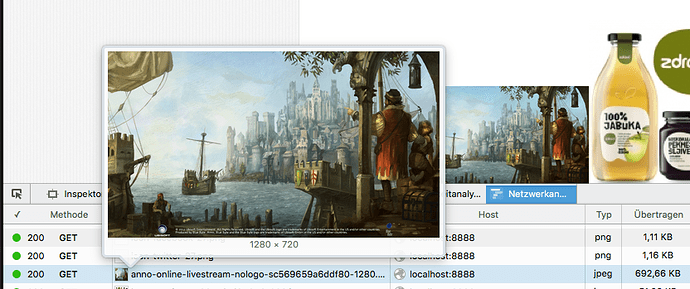
When user uploads image, for example 2000px wide, Sitecake will resample it in four sizes: 1280px, 960px, 640px and 320px. Original will be deleted and replaced with 1280px version. (we did this because some users were uploading a lot of huge images and having performance and storage issues)
Sitecake will form <img> tag like this:
<img style="width:100%; max-width:100%;" src="image-320.jpg" srcset="image-1280.jpg 1280w, image-960.jpg 960w, image-640.jpg 640w, image-320.jpg 320w">
src attribute is used only by browsers that do not support srcset. So, src is becoming less and less important. See srcset browser support here. As you can see, most modern browsers support srcset. Browser is doing image selection from the set, based on the screen size, browser window size, etc…
In this example, 320px image size is selected for src because the image was placed in a column within five column layout.
When I tested 2000px image (PC, 1920x1200 screen) Firefox and Edge browser served different sizes depending on browser window width. Chrome was ignoring the image selection and always displayed 1280px version. This is clearly an issues and we will see how we resolve it.
All thoughts and comments are welcome. We want to make robust and practical solution and current implementation is just first shot in a row.


